The Science of Data Visualization: Which Charts Actually Work Best for Human Comprehension
Decades of cognitive research reveal that the human brain processes certain visual encodings—like length and position—far more accurately than area or color. Here is the evidence behind which charts work, which fail, and why.
By Factlen Editorial Team
- Cognitive Scientists
- Researchers focused on the empirical testing of visual processing and elementary perceptual tasks.
- Vision Researchers
- Scientists studying the physiological and neurological mechanisms of color and shape perception.
- Data Visualization Practitioners
- Designers and analysts applying cognitive rules to create clear, actionable dashboards in the real world.
What's not represented
- · Neurodivergent individuals whose visual processing may differ from baseline studies
- · Accessibility advocates focused on screen-reader compatibility for data
Why this matters
Understanding how the brain decodes charts empowers professionals to present data clearly and prevents readers from being misled by poorly designed graphics in news, health, and finance.
Key points
- Human brains decode position and length far more accurately than area, volume, or color.
- Bar charts and scatter plots sit at the top of the cognitive accuracy hierarchy.
- Pie charts are poor for direct comparisons but effective for part-to-whole proportional judgments.
- Switching between different chart types (like bar to pie) increases cognitive load and slows comprehension.
- Color perception is highly subjective and easily distorted by surrounding backgrounds and shape sizes.
The modern world produces an overwhelming volume of data, but the human brain did not evolve to read spreadsheets. To make sense of billions of rows of information, we rely on data visualization—translating numbers into shapes, lines, and colors. But this translation is not purely an art form; it is a rigorous cognitive science.[5][6]
For decades, statisticians and psychologists have studied "graphical perception," the specific cognitive processes our visual cortex uses to decode information encoded in graphs. The consensus is clear: not all charts are created equal. Some visual encodings map perfectly onto human neural hardware, while others force the brain to guess.[1][6]
The foundational evidence for this hierarchy comes from a landmark 1984 study by statisticians William Cleveland and Robert McGill. They sought to replace the unstructured "wisdom" of chart design with empirical data, testing how accurately human subjects could extract numerical values from different visual formats.[1]
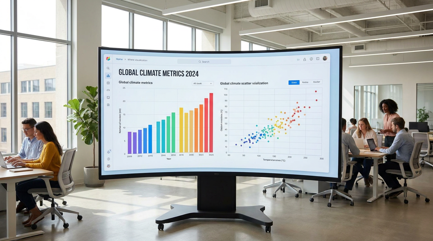
Cleveland and McGill established a definitive ranking of "elementary perceptual tasks." At the very top of the hierarchy—meaning the easiest and most accurate for humans to decode—is "position along a common scale." This is why bar charts and scatter plots are so universally effective. When we look at a bar chart, we are simply comparing where the tops of the bars align on a shared axis, a task our visual system performs with near-perfect precision.[1][2]

Further down the hierarchy are judgments based on length, direction, and angle. Even lower are area and volume. At the very bottom of the accuracy scale are shading and color saturation. If a visualization relies on the exact shade of red to communicate a precise number, the viewer is almost guaranteed to misinterpret it.[1][3]
In 2010, researchers Jeffrey Heer and Michael Bostock replicated Cleveland and McGill's laboratory experiments using thousands of participants on the crowdsourcing platform Amazon Mechanical Turk. The results held up perfectly across a much larger, more diverse population, confirming that these perceptual hierarchies are deeply hardwired into human cognition, not just artifacts of a small lab setting.[2]
This cognitive hierarchy explains the enduring controversy over the pie chart. Data visualization purists have long argued against pie charts because they force the brain to compare angles and areas—tasks that sit low on the Cleveland-McGill accuracy scale. When slices are similar in size, the human eye simply cannot tell which is larger without reading the text labels.[1][4]
This cognitive hierarchy explains the enduring controversy over the pie chart.
However, recent cognitive research offers a more nuanced defense of the pie chart. While bar charts are demonstrably superior for comparing discrete values, pie charts excel at a different cognitive task: proportional judgments. When the goal is to understand a "part-to-whole" relationship—such as seeing that one category makes up roughly a quarter of the total—the brain processes the circular area quite efficiently.[4][6]

The cognitive load of a chart also depends on the viewer's mental models, known as "graph schemas." A 2022 study published in Frontiers in Psychology demonstrated that switching between different types of charts carries a measurable cognitive cost. Because bar charts and line graphs both use a Cartesian coordinate system with X and Y axes, the brain can switch between them easily.[4]
Conversely, pie charts use a polar coordinate system. The researchers found that when viewers are forced to switch back and forth between bar charts and pie charts, their reaction times slow down significantly. The brain has to actively unload one visual schema and load another, suggesting that dashboards should avoid mixing fundamentally different chart types unless absolutely necessary.[4][6]
Color presents an entirely different set of perceptual challenges. Many data visualizations use color gradients to convey values, such as heat maps showing temperature or population density. But vision science reveals that human color perception is highly subjective and easily distorted by context.[3]
Research by vision scientist Danielle Albers Szafir highlights that conventional color appearance models assume colors are viewed in large, uniform patches. In data visualization, however, colors are often applied to tiny shapes—thin lines, small scatter plot dots, or narrow bars. As the shape gets smaller, the human eye's ability to distinguish between similar colors degrades sharply.[3]
Furthermore, the background against which a color is placed alters its perceived value, a phenomenon known as simultaneous contrast. A medium-blue data point will look lighter on a dark background and darker on a light background, potentially leading a viewer to extract the wrong numerical value simply because of the surrounding pixels.[3][6]

To mitigate these perceptual errors, researchers recommend using perceptually uniform color spaces, where equal steps in data value correspond to equal perceptual steps in color difference. Traditional "rainbow" color maps, which cycle through the spectrum, are notoriously bad at this, creating false boundaries and hiding actual gradients in the data.[3][5]
The ultimate goal of this evidence pack is to empower creators and consumers of data. By understanding the cognitive science of graphical perception, we can stop designing charts that look pretty but fail to communicate. When the stakes are high—whether in public health reporting, financial analysis, or scientific discovery—aligning our visual encodings with human neurology ensures that the truth of the data is actually seen.[1][6]
How we got here
1984
William Cleveland and Robert McGill publish their foundational hierarchy of graphical perception.
2010
Jeffrey Heer and Michael Bostock validate the 1984 findings at scale using crowdsourced internet participants.
2018
Vision scientists publish updated models on how color perception degrades when applied to small data points.
2022
Research demonstrates the cognitive 'switch costs' of alternating between Cartesian (bar) and polar (pie) graph schemas.
Viewpoints in depth
Cognitive Scientists
Researchers focused on the empirical testing of visual processing and elementary perceptual tasks.
This camp approaches data visualization as a measurable psychological phenomenon. By running controlled experiments—asking subjects to extract numbers from various chart types and measuring their error rates—they have established a hard science of graphical perception. Their foundational belief is that chart design should be dictated by human neural hardware, favoring position and length over area and color.
Vision Researchers
Scientists studying the physiological and neurological mechanisms of color and shape perception.
Vision researchers look at the low-level mechanics of the eye and visual cortex. They highlight how phenomena like simultaneous contrast and lightness constancy distort our perception of data. Their work demonstrates that color is highly subjective and heavily influenced by surrounding pixels, leading them to advocate for perceptually uniform color spaces and to caution against relying on color to convey precise quantitative values.
Data Visualization Practitioners
Designers and analysts applying cognitive rules to create clear, actionable dashboards in the real world.
Practitioners take the empirical findings of cognitive and vision scientists and apply them to business, journalism, and public health. While they respect the Cleveland-McGill hierarchy, they also balance accuracy with engagement and narrative flow. They recognize that while a bar chart is technically the most accurate, a well-designed pie chart or heatmap can sometimes be more effective at quickly communicating a high-level trend to a lay audience.
What we don't know
- How interactive and animated charts affect cognitive load compared to the static charts used in most historical perception studies.
- Whether the Cleveland-McGill hierarchy holds perfectly true for neurodivergent populations, as most baseline studies relied on neurotypical subjects.
- The exact threshold at which a dataset becomes too complex for a standard bar chart, necessitating a shift to less accurate but more dense visual encodings.
Key terms
- Graphical Perception
- The visual and cognitive processes the human brain uses to decode information encoded in graphs.
- Elementary Perceptual Task
- The basic visual judgments (like comparing length, area, or color) required to extract quantitative information from a chart.
- Graph Schema
- The mental model or framework the brain uses to interpret a specific type of chart, such as a Cartesian grid for bar charts or a polar system for pie charts.
- Perceptually Uniform Color Space
- A color scale designed so that equal steps in numerical value correspond to equal perceived differences in color.
Frequently asked
Why do data experts dislike pie charts?
Pie charts require the brain to compare angles and areas, which humans do poorly compared to judging length or position. They are only effective for simple part-to-whole comparisons.
What is the most accurate chart type?
According to cognitive research, charts that use 'position along a common scale'—like bar charts and scatter plots—are the easiest and most accurate for the human brain to decode.
Why shouldn't I use a rainbow color scale?
Rainbow color maps are not perceptually uniform. Equal changes in the data do not look like equal changes in color, which can hide real trends and create false boundaries.
Sources
Source coverage
6 outlets
3 viewpoints surfaced


[1]Journal of the American Statistical AssociationCognitive Scientists
Graphical Perception: Theory, Experimentation, and Application to the Development of Graphical Methods
Read on Journal of the American Statistical Association →[2]ACM CHI Conference ProceedingsCognitive Scientists
Crowdsourcing Graphical Perception: Using Mechanical Turk to Assess Visualization Design
Read on ACM CHI Conference Proceedings →[3]Journal of VisionVision Researchers
Color Perception in Data Visualizations
Read on Journal of Vision →[4]Frontiers in PsychologyVision Researchers
Switching between data graphs: The role of graph schemas
Read on Frontiers in Psychology →[5]Harvard Business ReviewData Visualization Practitioners
The Science of Data Visualization
Read on Harvard Business Review →[6]Factlen Editorial TeamData Visualization Practitioners
Synthesis by Factlen editorial team
Read on Factlen Editorial Team →

More in data analysis
See all 17 stories →Synthetic Data
The Efficacy of Synthetic Data: Can AI-Generated Datasets Solve the Privacy and 'Data Wall' Crises?
8 sources

Synthetic Data
The Synthetic Data Revolution: How AI is Generating Its Own Training Ground
7 sources

Synthetic Data
The Evidence for Synthetic Data: Can AI Safely Replace Real Patient Records?
6 sources
Exercise Science
The Evidence Pack: Does Zone 2 Cardio Actually Optimize Longevity?
6 sources

Every angle. Every day.
Get data analysis stories with full source coverage and perspective breakdowns delivered to your inbox.